Theme and UI Customization
1. Experience Xamarin "Hot Reload" feature
This feature will dramatically speed up your inner development loop when working with Xamarin.Forms XAML. XAML Hot Reload instantly reflects changes you make in your running app, without requiring you to stop and rebuild.
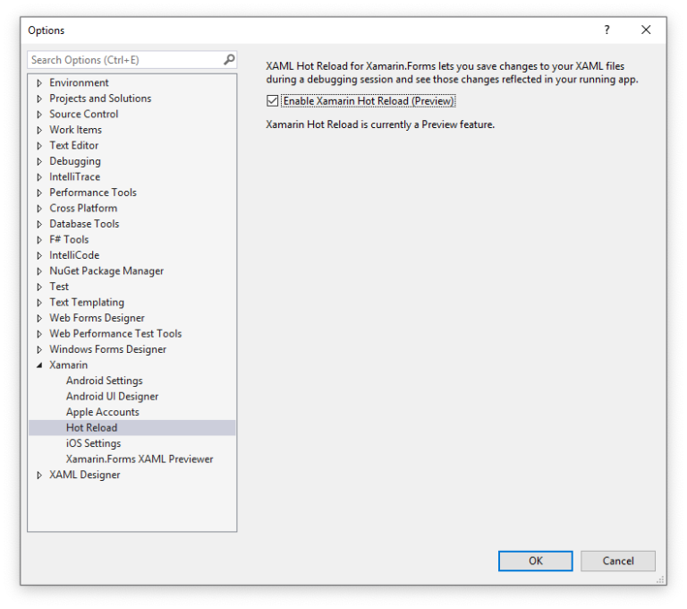
No additional installation is required to use XAML Hot Reload, but you might have to double check your configuration to ensure the best experience. First, enable it in your IDE settings:
- On Windows, check the Enable Xamarin Hot Reload checkbox at Tools > Options > Xamarin > Hot Reload.
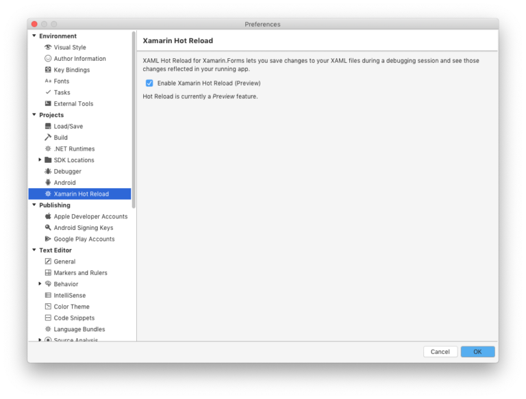
- On Mac, check the Enable Xamarin Hot Reload checkbox at Visual Studio > Preferences > Tools for Xamarin > XAML Hot Reload.
note
In earlier versions of Visual Studio for Mac, the menu is at Visual Studio > Preferences > Projects > Xamarin Hot Reload.
To learn more about Xamarin Hot Reload you can refer to this link https://docs.microsoft.com/en-us/xamarin/xamarin-forms/xaml/hot-reload
2. Splash Screen
For Splash screen this app uses Lottie Animations. Lottie is an awesome library created by Airbnb that allows you to run animations. It works by using a Json file that provides the content to render the animation.


Following steps guide how to change Splash screen, by platform specific Android and iOS:
a. Android
A SplashActivity is inserted before MainActivity to realize the splash screen. We implemeted LottieAnimationView as view layout of SplashActivity.
- Step 1: Change background color:
Go to Resources > values > colors.xml, change the hex color at:
- Step 2: Change animation:
Prepare your animation JSON file, then go to Resources > layout > Activity_Spash.xml, change the JSON file name:
note
It's recommended that you put the JSON file in Assets folder. The JSON file "loading_gears" specified in the layout is placed in Assets with Properties > BuildAction = “AndroidAsset”.
tip
You can find some useful json animation file here https://lottiefiles.com/, add customization to it as well
b. iOS
Similar to Android, iOS realizes a splash screen by sandwiching one SplashViewController
- Step 1: Change background color:
Go to Resources > values > colors.xml, change the hex color at:
- Step 2: Change animation:
Prepare your animation JSON file, then open SplashViewController.cs file, change the JSON file name "loading_gears" to your JSON file name:
note
The JSON file specified by LOTAnimationView.AnimationNamed ("loading_gears") must be placed with Properties > BuildAction = “BundleResource” directly under the project.
3. Onboarding - Walkthrough Screens
For Walkthrough screens, we used SVG with gradient images, this brings a super flexible to add any designs to adapt with any business type. Simply change the images, and displaying text to create new awesome walkthrough page.
SVG images are placed at Images folder, to change walkthrough screens design, go to ViewModels > OnBoardingViewModel.cs, make the change in svg image file name:
4. Horizontal List (Home Screen)
The Horizontal Lists at home screen display all Posts article from Wordpress site by Posts Categories, e.g: the What's News horizontal list loads all posts under What's New's post category.
This approach brings you a flexible way to change/update the client-side's content when the app turned into production. Simply go to Wordpress dashboard and add new post, put it under predefined Categories.
Following steps show how to change Horizontal Lists
5. Store Location Page
6. About Us Page
7. Styles and Themes
a. Texts, Fonts and Icons
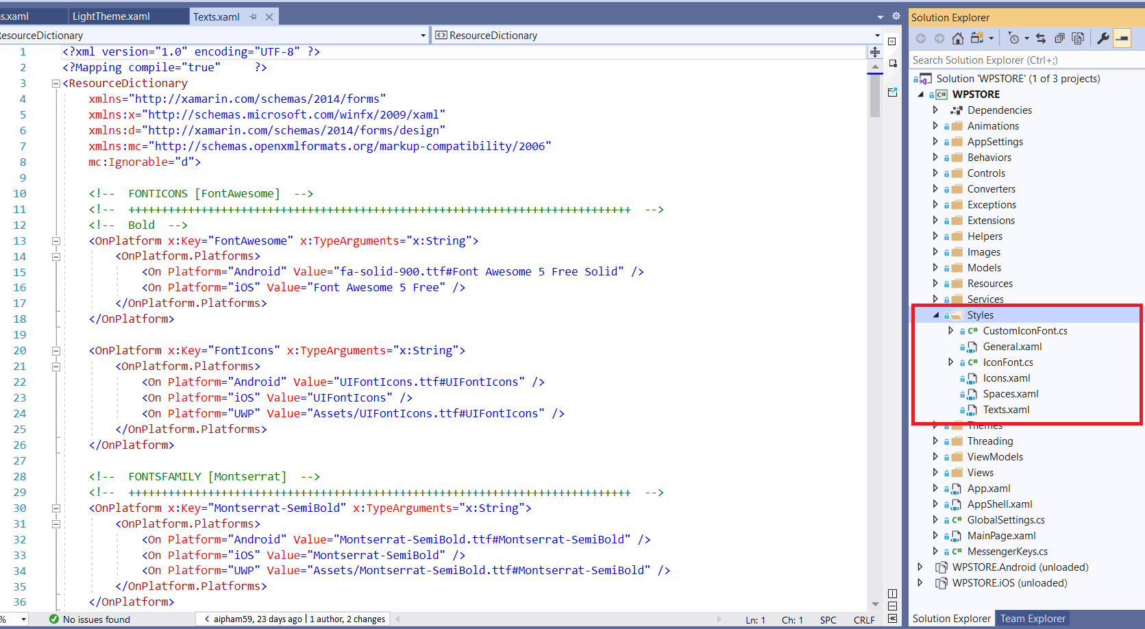
Text styles, fonts and font icons used in the application are defined under Styles folder
- Text Styles are defined in Texts.xaml:
- App Fonts: this app uses 2 fonts family Montserrat and ProductSans.
To add new fonts, please put your new fonts under Assets folder (for Android), and Resources folder (for iOS), then replace the font name in Value text string.
- Font Icons: this app uses Font Awesome (Free licenses) for most of icons, it's including over 5000 HD Icons that can cover many business type that your app needed.
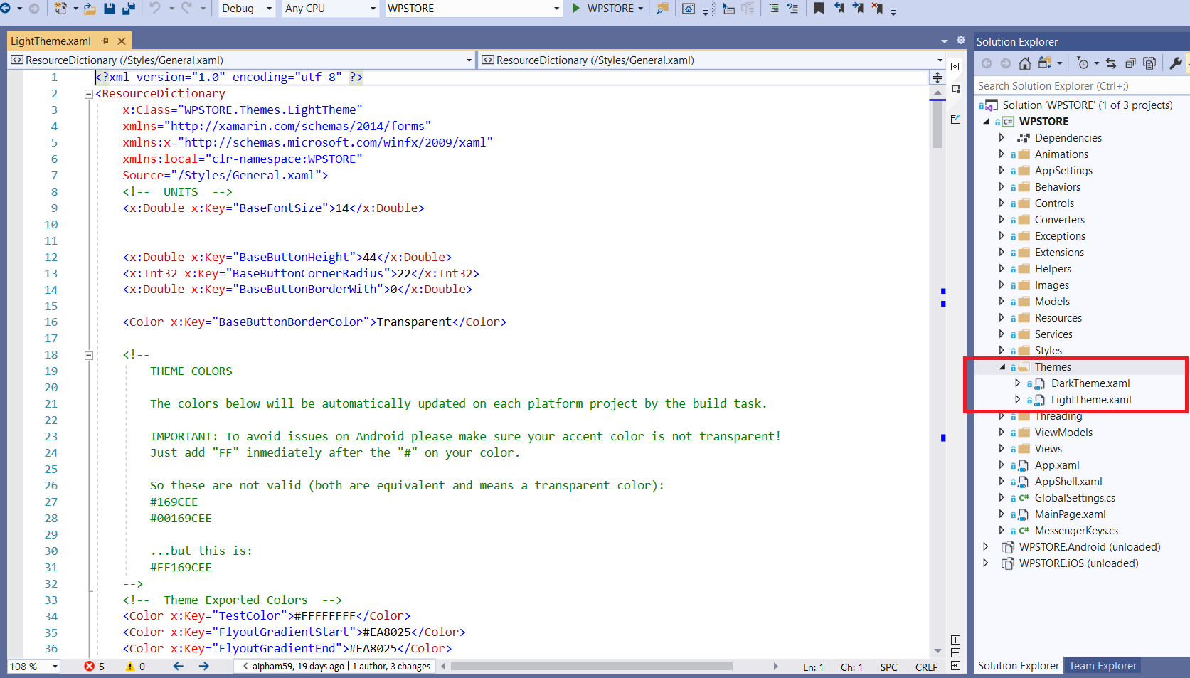
b. Themes and Color
XStore has 2 predefined theme: Light Theme (default theme) and Dark Theme.